Introduction
The user is therefore able to:
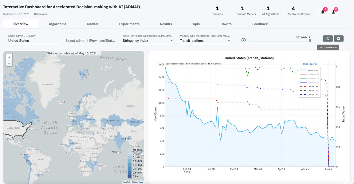
Drill deep to understand the index and mobility type of each country
The NPI-Index,Compliance Score and the Stringency Index imposed on the different mobility types(Transit stations, Retail and recreation, Grocery and pharmacy, Parks and Workplaces) in different countries can be clearly observed
Select time scales to visualize
For a more focused analysis, the user can choose to visualize the new Covid 19 cases at a particular time or over a certain period of time
Select the data to visualize
The time series graph, allows for visualization of a specific dataset.
The regional map, on the other hand, gives insights on the amount of data present for a specific region given a certain index and mobility type.
Playback the drop or rise of the Covid 19 cases over time
Clicking the Play button allows for visualization of the changes in the Covid 19 cases over time
