Data Visualization in Python using Matplotlib and Seaborn
In this module of the course, we will use some of the libraries available with Python and Jupyter to examine our data set. In order to better understand the data, we can use visualizations such as charts, plots, and graphs. We'll use some common tools such as matplotlib and seaborn and gather some statistical insights into our data.
We'll continue to use the insurance.csv file from your project assets, so if you have not already downloaded this file to your local machine, and uploaded it to your project, do that now.
If you have not already done so, make sure that you do the work for your project setup
Getting Started with Jupyter Notebooks
Instead of writing code in a text file and then running the code with a Python command in the terminal, you can do all of your data analysis in one place. Code, output, tables, and charts can all be edited and viewed in one window in any web browser with Jupyter Notebooks. As the name suggests, this is a notebook to keep all of your ideas and data explorations in one place.
Jupyter notebooks are an open-source web application that allows you to create and share documents that contain live code, equations, visualizations and explanatory text.
Open the Jupyter notebook
- Go the (☰) navigation menu and under the Projects section click on
All Projects.
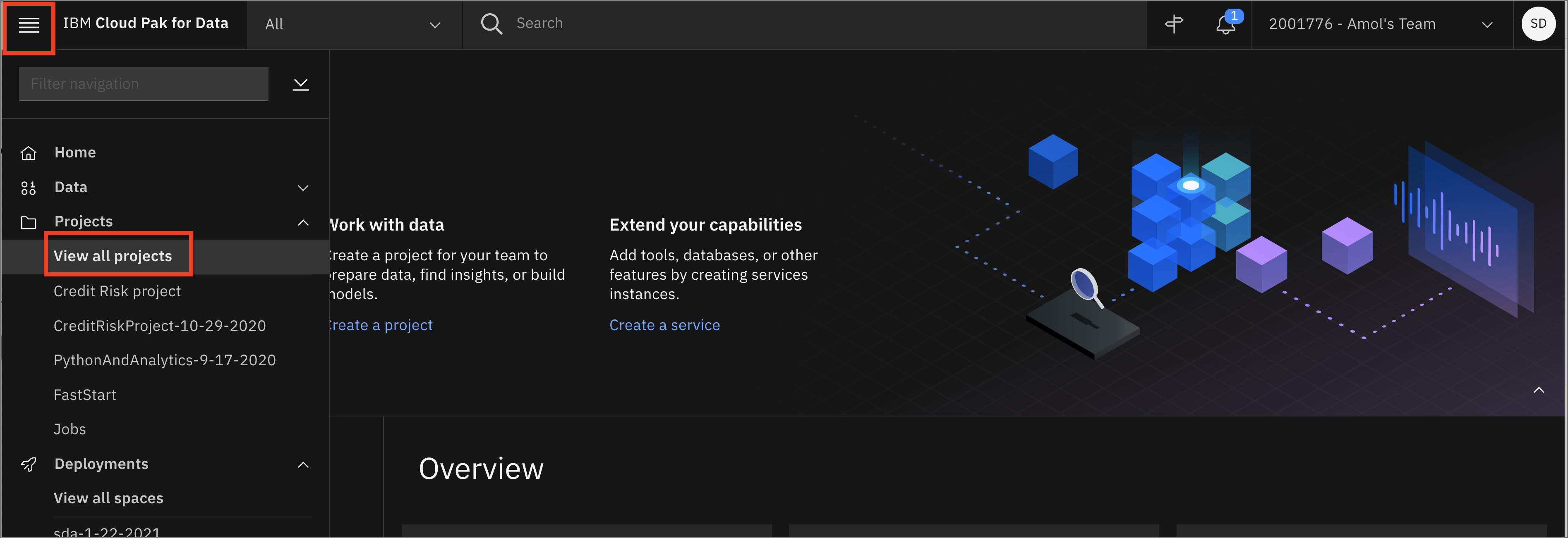
-
Click the project name you created in the pre-work section.
-
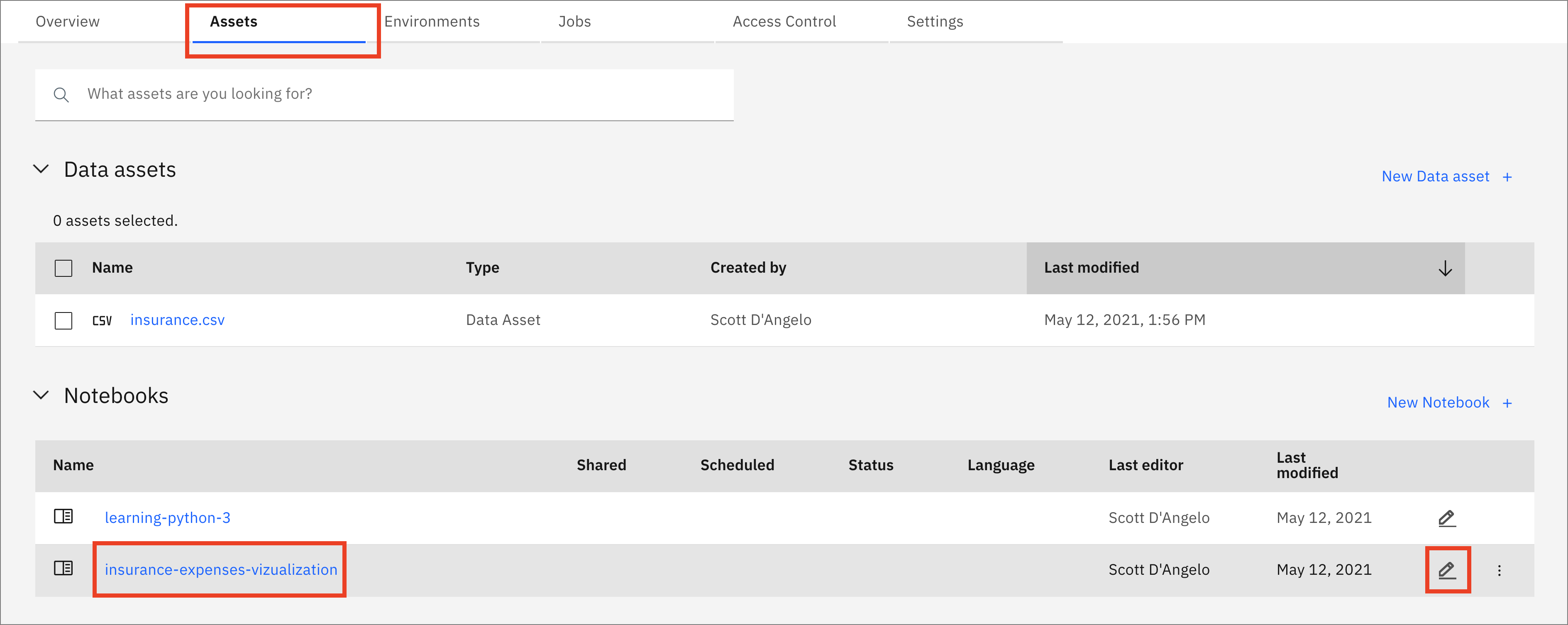
From your
Projectoverview page, click on theAssetstab to open the assets page where your project assets are stored and organized. -
Scroll down to the
Notebookssection of the page and click on the pencil icon at the right of theinsurance-expenses-vizualization.ipynbnotebook.
- When the Jupyter notebook is loaded and the kernel is ready, we will be ready to start executing it in the next section.
Run the Jupyter notebook
Spend some time looking through the sections of the notebook to get an overview. A notebook is composed of text (markdown or heading) cells and code cells. The markdown cells provide comments on what the code is designed to do.
You will run cells individually by highlighting each cell, then either click the Run button at the top of the notebook or hitting the keyboard short cut to run the cell (Shift + Enter but can vary based on platform). While the cell is running, an asterisk ([*]) will show up to the left of the cell. When that cell has finished executing a sequential number will show up (i.e. [17]).
Note: Some of the comments in the notebook (those in bold red) are directions for you to modify specific sections of the code. Perform any changes as indicated before running / executing the cell.
Load and Prepare Dataset
-
Section
2.0 Load the datawill load the data set we will use to build out machine learning model. In order to import the data into the notebook, we are going to use the code generation capability of Watson Studio. -
Highlight the code cell below by clicking it. Ensure you place the cursor below the first comment line.
-
Click the
01/00"Find data" icon in the upper right of the notebook to find the data asset you need to import. -
For your dataset, Click
Insert to codeand chooseInsert Pandas DataFrame. The code to bring the data into the notebook environment and create a Pandas DataFrame will be added to the cell below. -
Run the cell and you will see the first five rows of our dataset.
-
Since we are using generated code to import the data, you will need to update the next cell to assign the
dfvariable. Copy the variable that was generated in the previous cell ( it will look likedf=data_df_1,data_df_2, etc) and assign it to thedfvariable (for exampledf=df_data_1).
Continue to run the notebook
- Finishing running all of the cells. Carefully read all of the markdown comments to gain some understanding of how data vizualization can be use to gain insight into the data set.