Data Processing with Data Refinery
In this module, we will prepare our data assets for analysis. We will use the Data Refinery graphical flow editor tool to create a set of ordered operations that will cleanse and shape our data. We will also explore the graphical interface to profile data and create visualizations to get a perspective and insights into the dataset.
This section is broken up into the following steps:
Note: You can click on any image in the instructions below to zoom in and see more details. When you do that just click on your browser's back button to return to the previous page.
Note: The lab instructions below assume you have completed the setup section already, if not, be sure to complete the setup first to create a project and a deployment space.
Merge and Cleanse Data
We will start by wrangling, shaping and refining our data. To do this, we will create a refinery flow to contain a series of data transformation steps.
-
Go the (☰) navigation menu, expand
Projectsand click on the project you created during the setup section.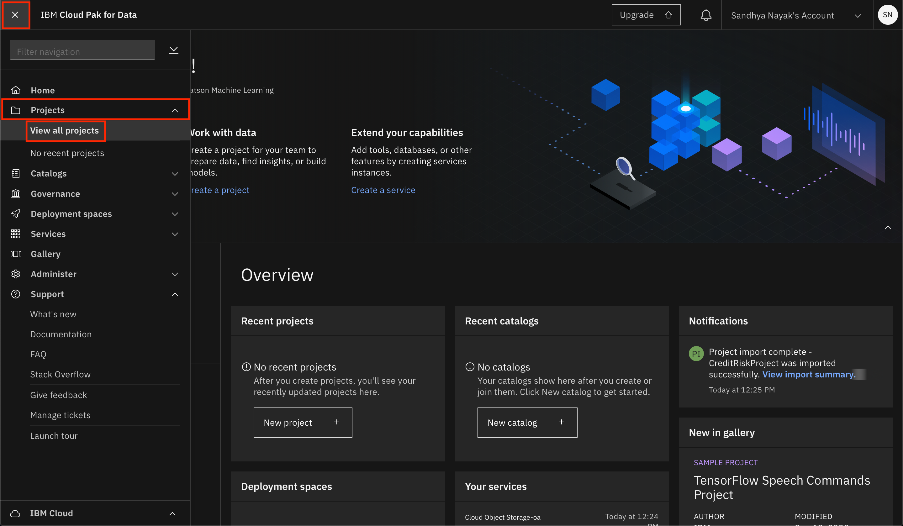
-
To create a data refinery flow, click the
Add to projectbutton from the top of the page and click theData Refinery flowoption.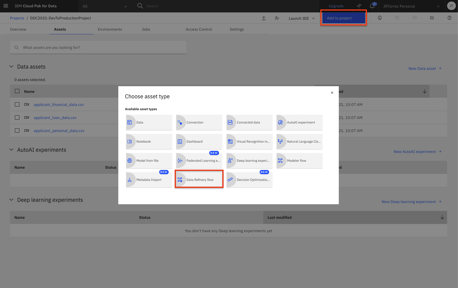
-
Select
Data assetson the left panel, then select theapplication_loan_data.csvdata asset. Then click theAddbutton.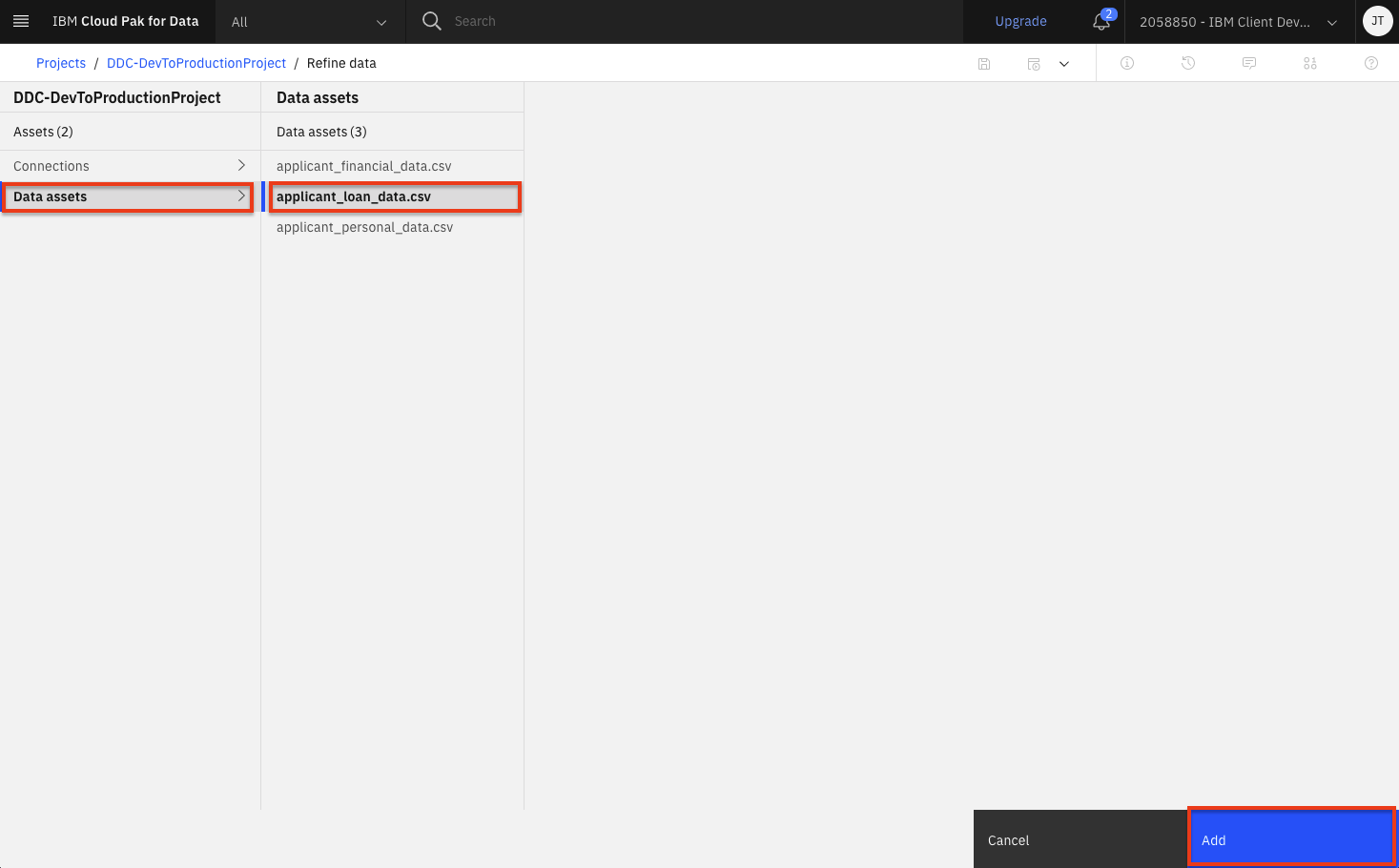
-
The first thing we want to do is create a merged dataset. Start by joining the loan data with information about the loan application. Click the
Operationbutton on the top left and then scroll down and select theJoinoperation.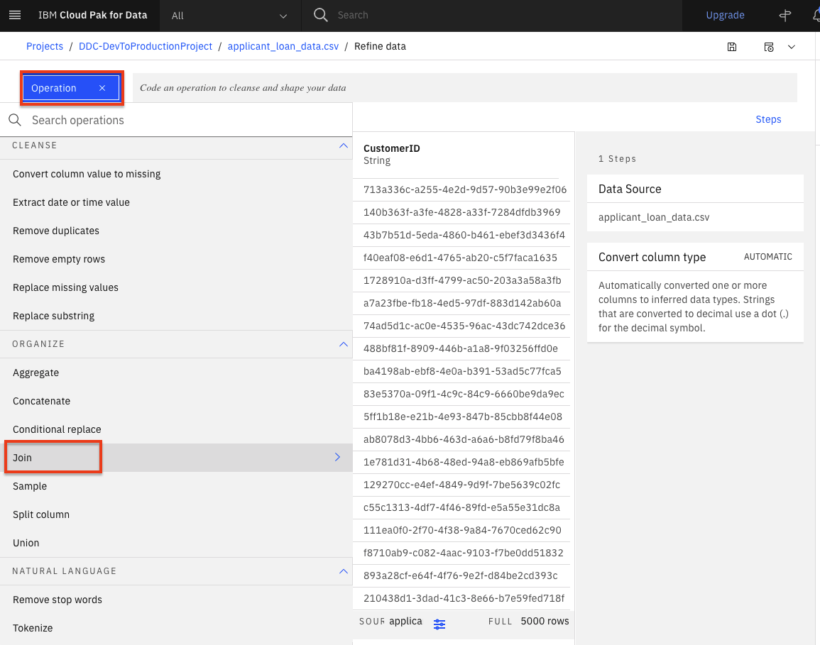
-
From the drop down list, select
Inner joinand then click theAdd data setlink to select the data asset you are going to join with.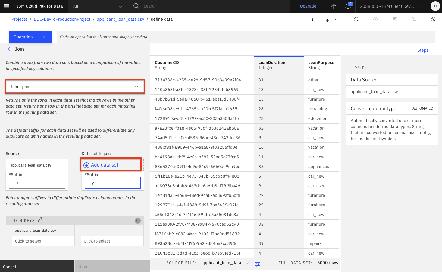
-
Select
Data assetson the left panel and this time select theapplication_personal_data.csvdata asset. Then click theApplybutton.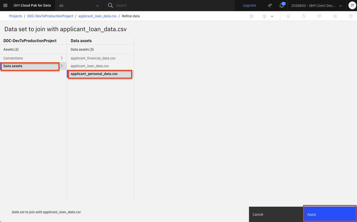
-
Finish setting the following values and then click the
Nextbutton:- Under the
Source*Suffixoption, enter_loan_ds. - Under the
Data set to join*Suffixoption, enter_personal_ds. -
Under the Join keys, click the input box and select
CustomerIDfor both data sets.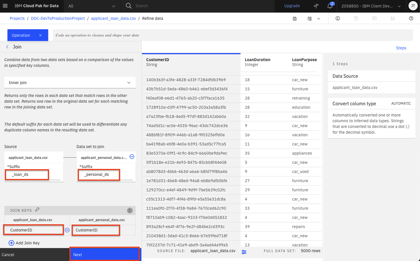
- Under the
-
Although we could modify what columns will be in the joined dataset, we will leave the default and include them all. Click the
Applybutton.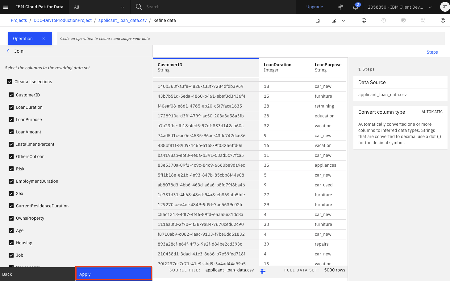
-
Repeat the five previous steps to join our other dataset (i.e the financial information for this applicant). Click the
Operationbutton on the top left and then scroll down and select theJoinoperation. Set the following values and then click theNextbutton:- Inner join
- Data set to join:
application_financial_data.csv - Under the
Source*Suffixoption, enter_loan_ds. - Under the
Data set to join*Suffixoption, enter_financial_ds. -
Under the Join keys, click the input box and select
CustomerIDfor both data sets.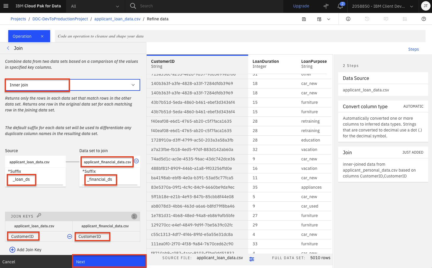
-
Click the
Applybutton to finish this final join. -
Let's say we've decide that there are columns that we don't want to leave in our dataset ( maybe because they might not be useful features in our Machine Learning model, or because we don't want to make those data attributes accessible to others, or any other reason). We'll remove the
FirstName,LastName,Email,StreetAddress,City,State,PostalCodecolumns. For each column to be removed:-
Click the
Operation +button, then select theRemoveoperation.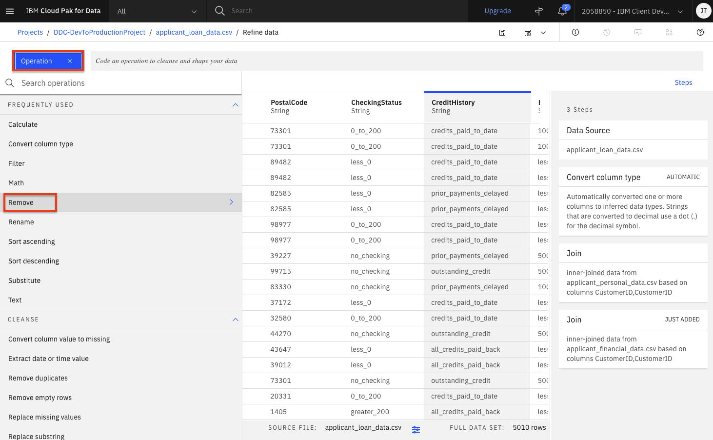
-
In the
Select columndrop down, choose one of the columns to remove (i.eFirstName). Click theNextbutton and then theApplybutton.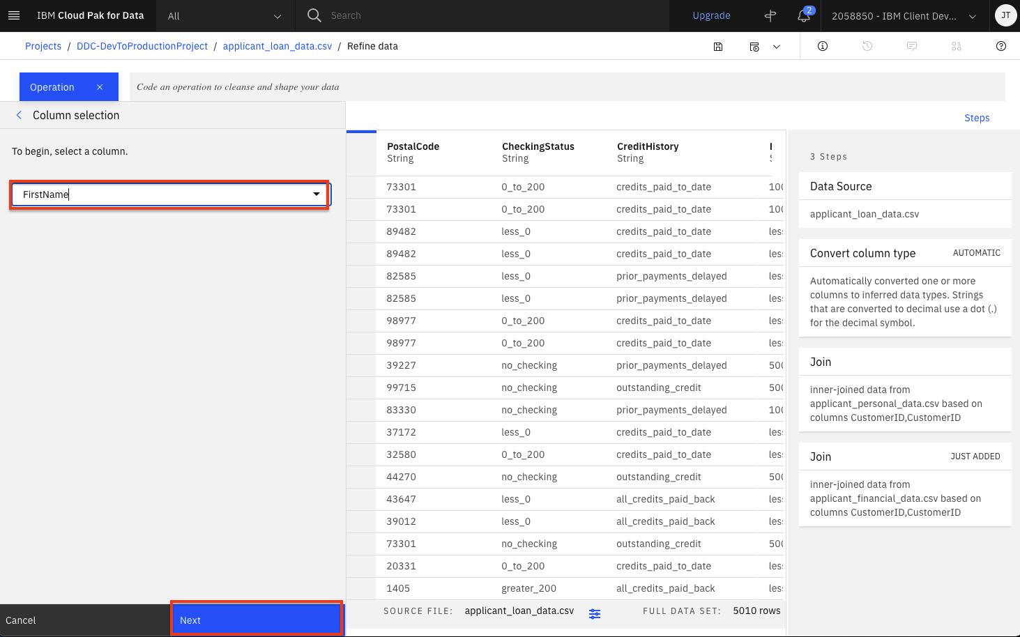
-
The column will be removed. Repeat the above two steps to remove the remaining six columns.
-
-
Finally, we want to ensure there is no duplicates in our dataset. Click the
Operationbutton once again and click theRemove duplicatesoperation.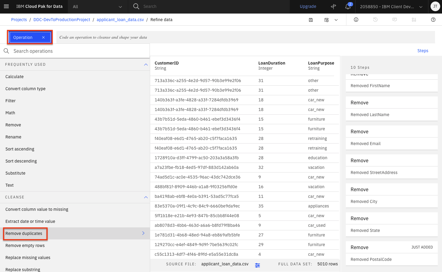
-
Select
CustomerIDas the column and click theNextbutton. Then click theApplybutton in the subsequent panel.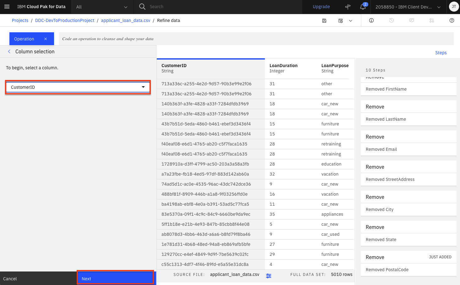
-
At this point, you have a data transformation flow with 11 steps. The flow keeps track of each of the steps and we can even undo (or redo) an action using the circular arrows. To see the steps in the data flow that you have performed, click the
Stepsbutton. The operations that you have performed on the data will be shown.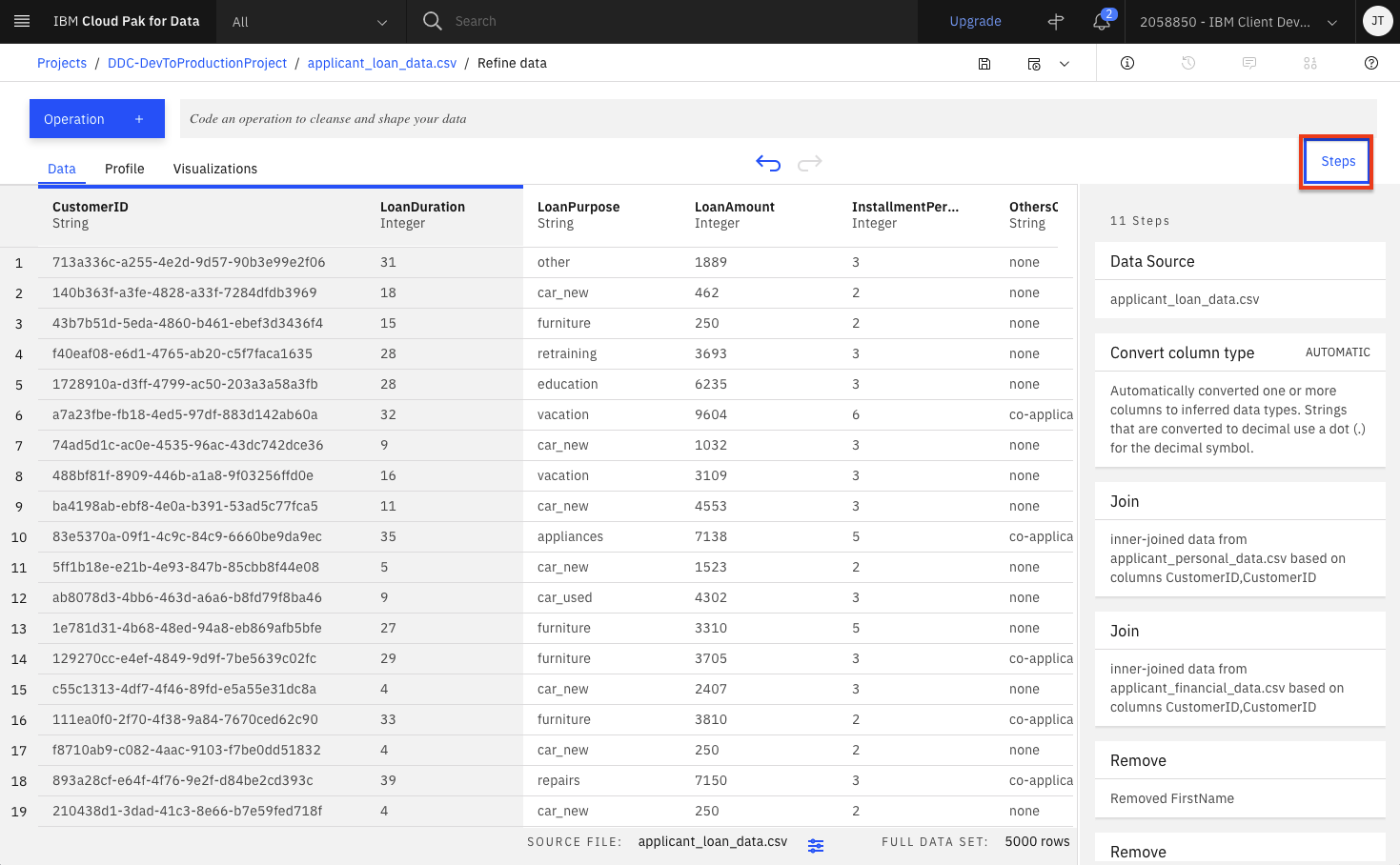
-
You can modify these steps and/or save for future use. Lets edit the flow name and output options. Click on the
Informationicon on the top right and then click theEditbutton.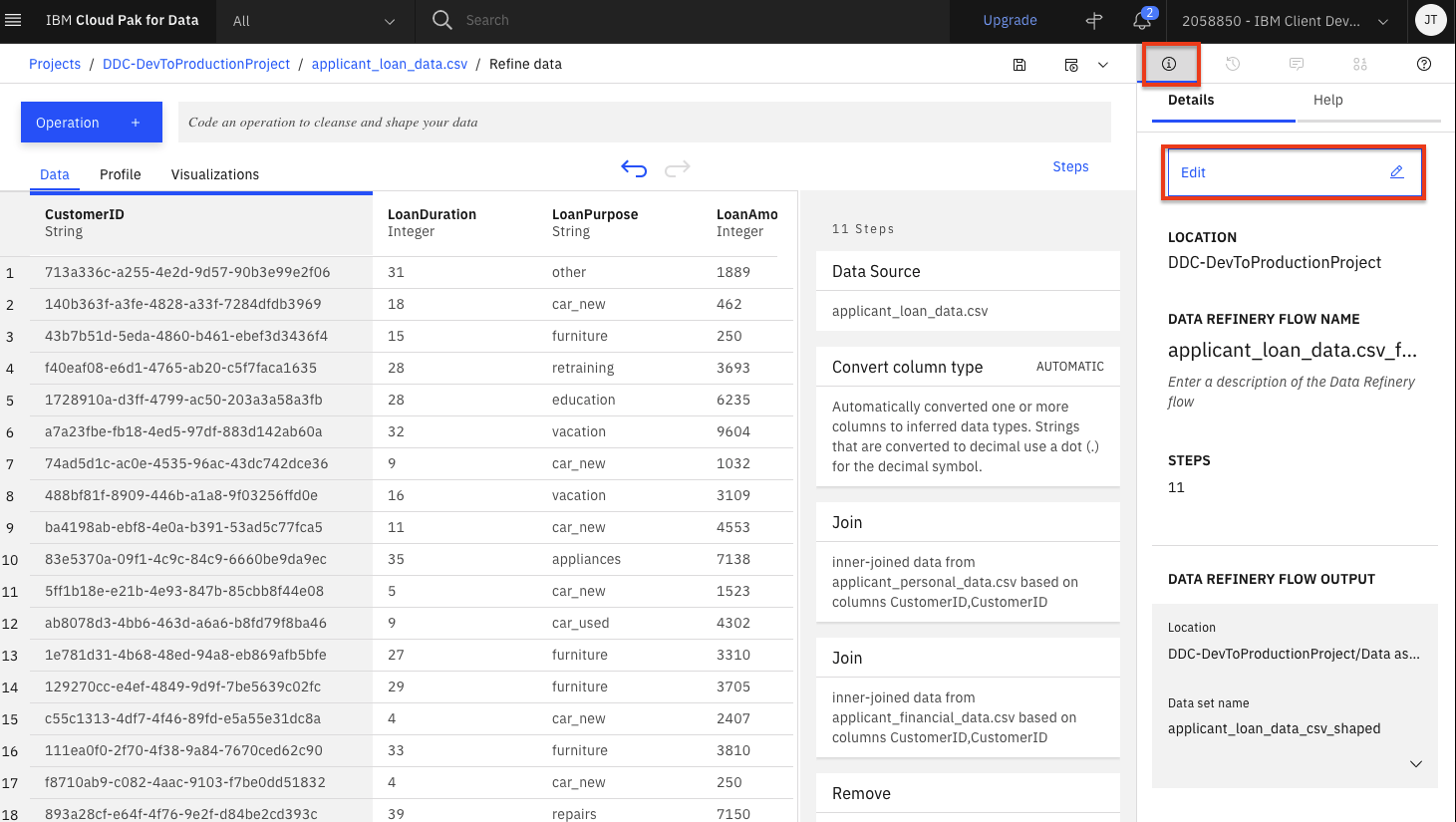
-
Click the pencil icon next to
Data Refinery Flow Name, set the name tocredit_risk_wrangling_cleaning_flowand click theApplybutton. Then click theEdit Output pencil iconand set the name tocredit_risk_shaped.csv(leave the rest of the CSV output defaults) and click the 'Check mark icon'. Finally, click theDonebutton
-
Click the
Saveicon to save the flow.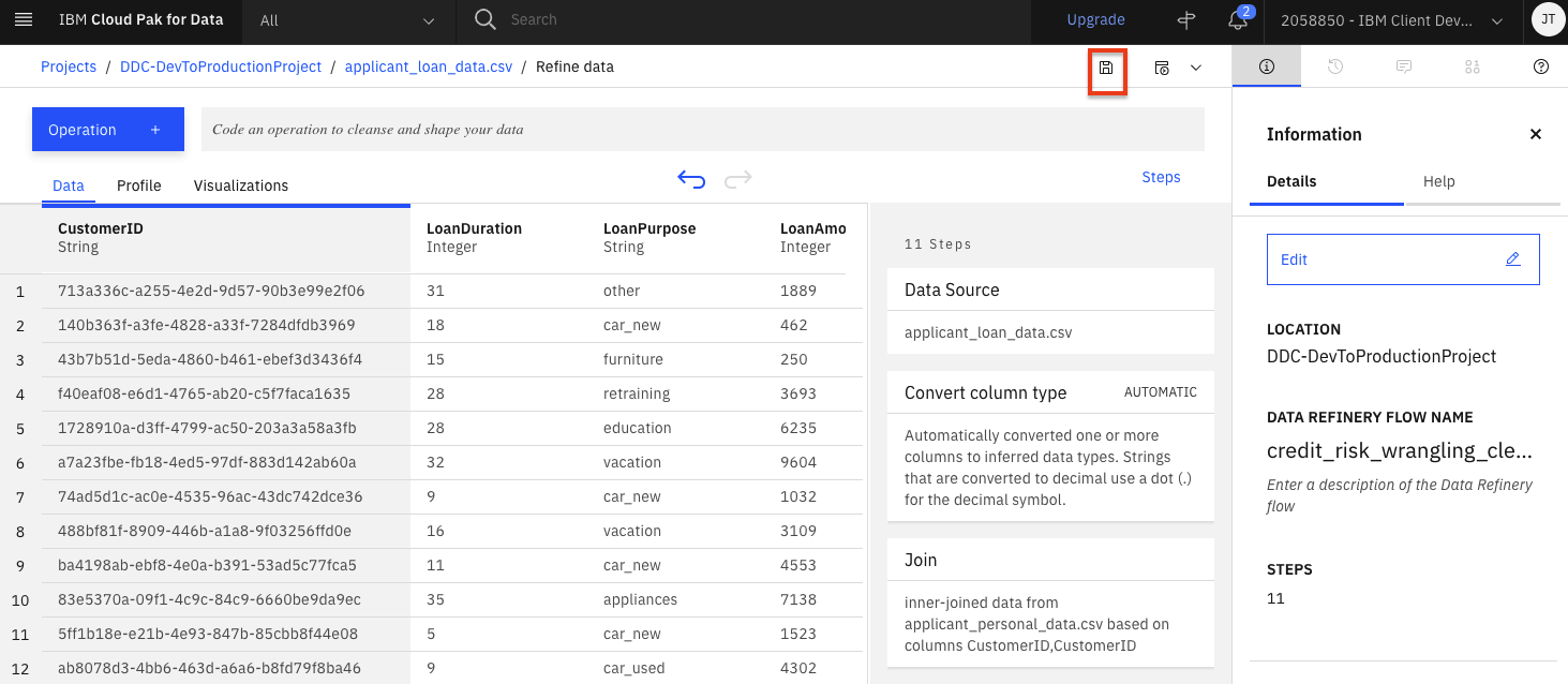
Run Data Flow Job
Data Refinery allows you to run these data flow jobs on demand or at scheduled times. In this way, you can regularly refine new data as it is updated.
-
Click on the
Jobsicon and thenSave and create a joboption from the menu.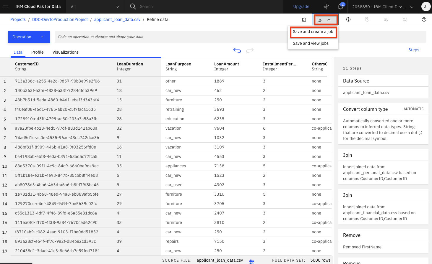
-
Give the job a name and optional description. Click the
Nextbutton.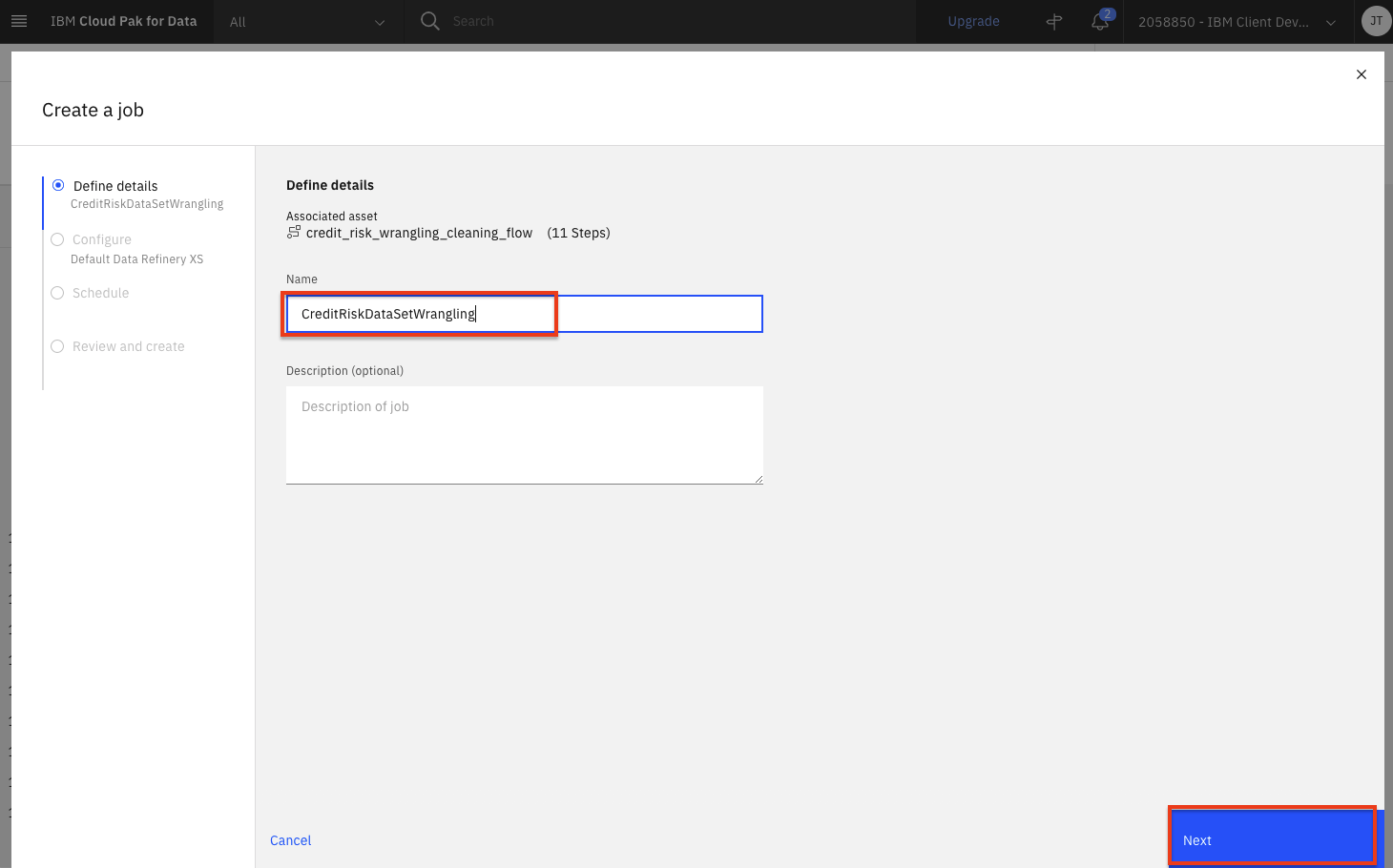
-
Click
Nexton the next two screens, leaving the default selections. You will reach theReview and createscreen. Note the output name, which iscredit_risk_shaped. Click theCreate and runbutton.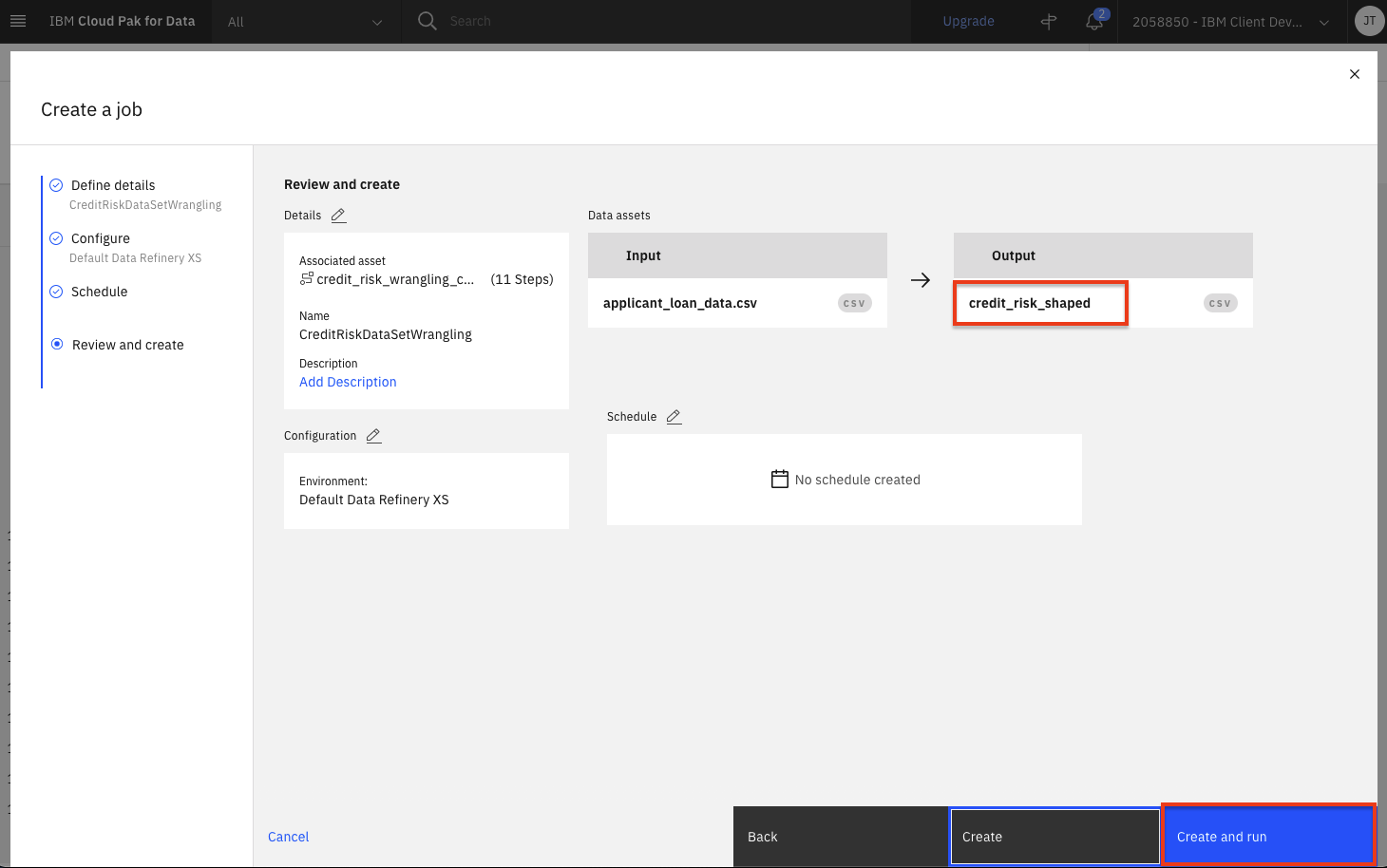
-
When the job is successfully created, you will receive a notification. Click on the
job detailslink in the notification panel to see the job status.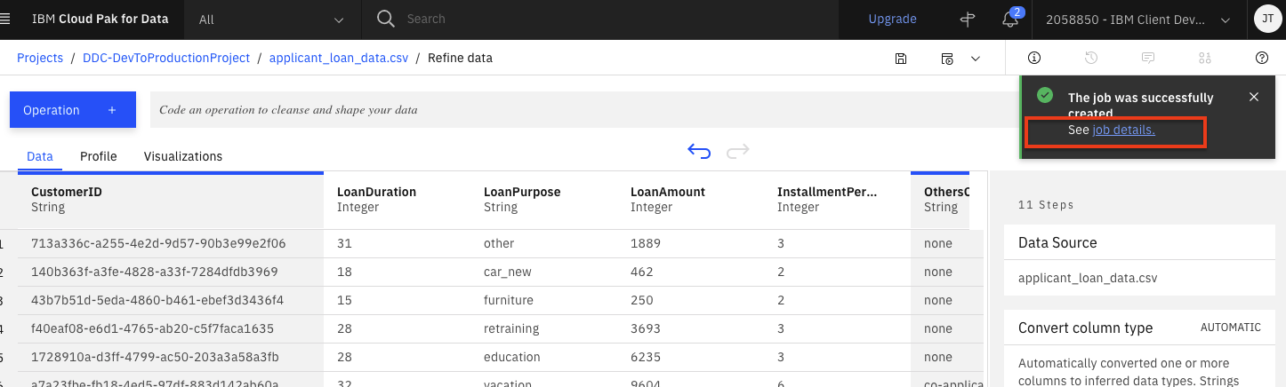
-
The job will be listed with a status of
Runningand then the status will change toCompleted. Once its completed, click theEdit configurationbutton.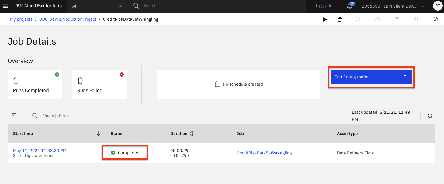
-
Click the pencil icon next to
Schedule.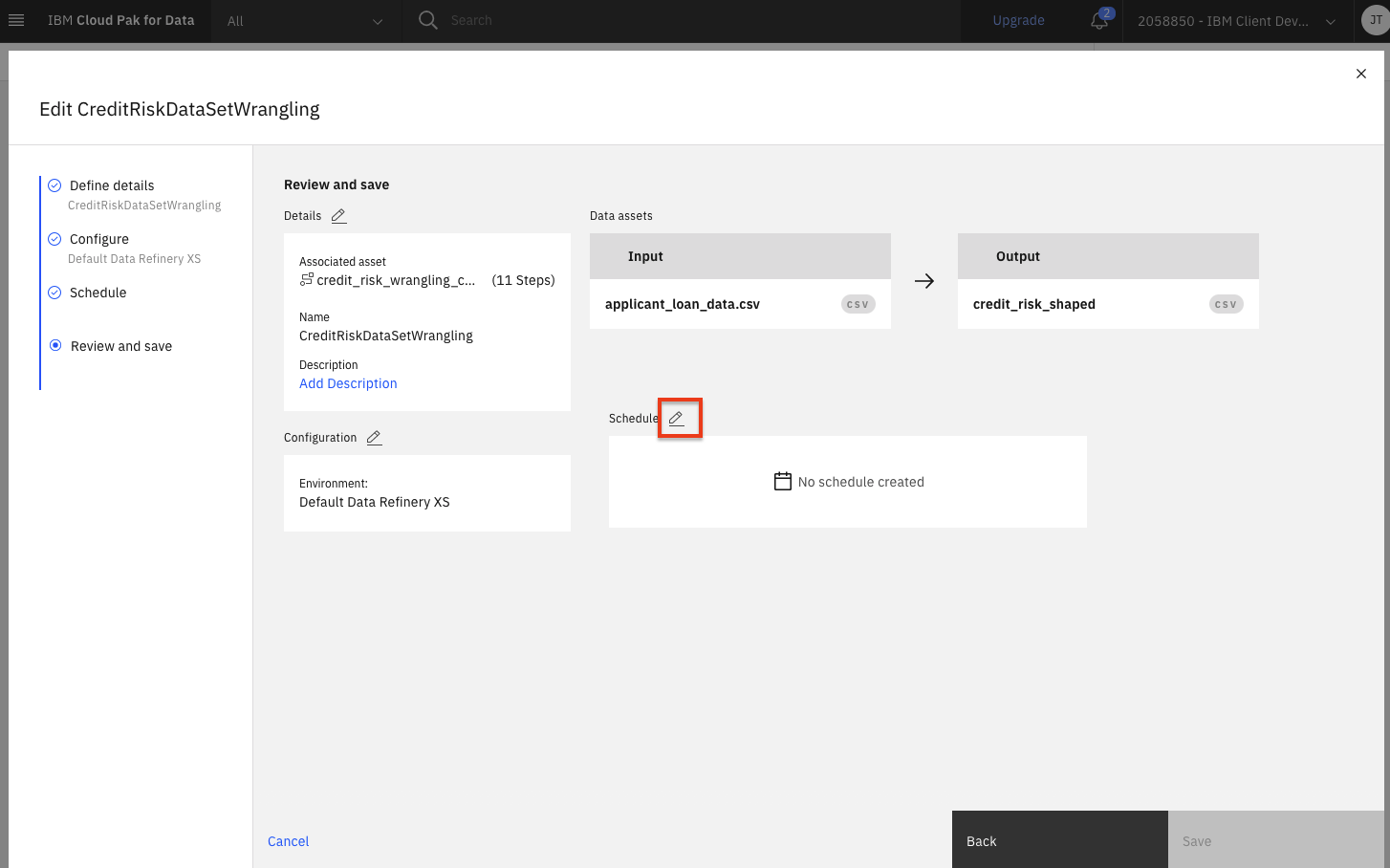
-
Notice that you can toggle the Schedule to run switch and choose a date and time to run this transformation as a job. We will not run this as a job, so go ahead and click the
Cancellink.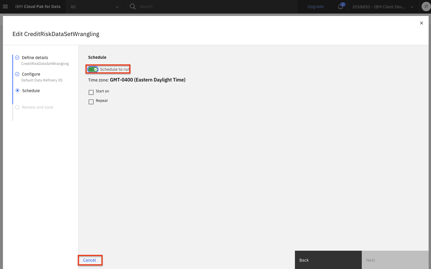
Profile Data
-
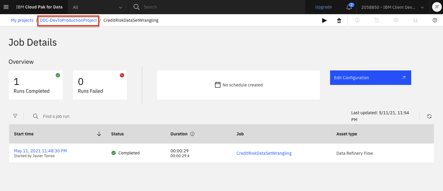
Go back to the project by clicking the name of the project in the breadcrumbs in the top left area of the browser.
-
Click the
Assetstab and then scroll down to theData Refinery flowssection and click on thecredit_risk_wrangling_cleaning_flowflow.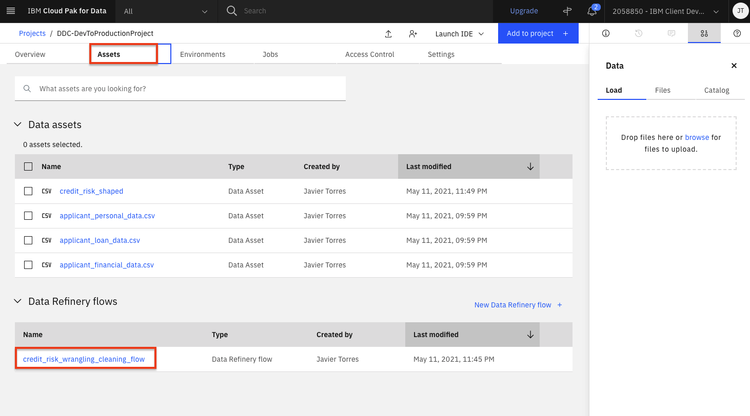
-
Wait for the flow operations to be applied and then click on the
Profiletab will bring up a view of several statistics and histograms for the attributes in your data.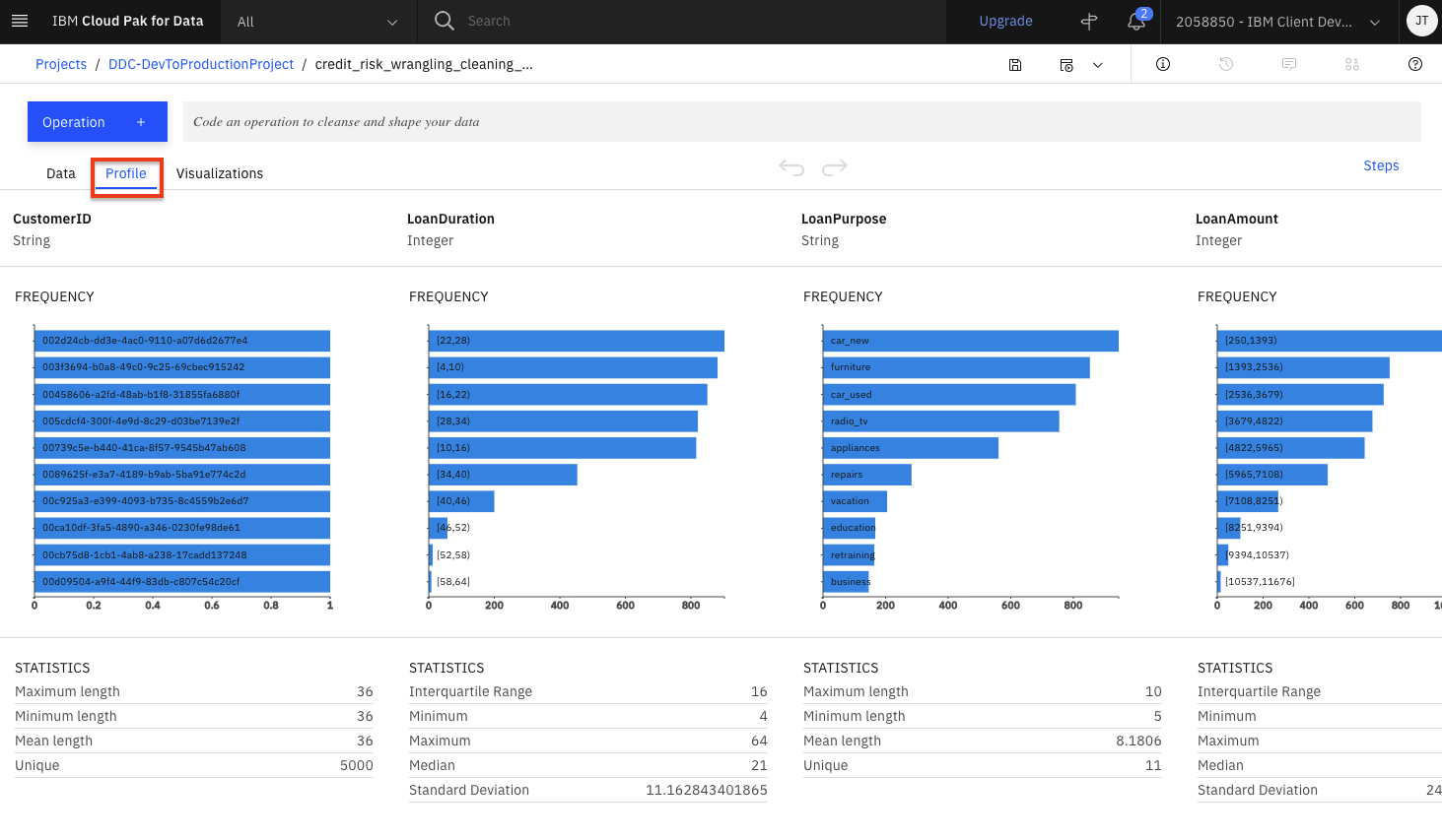
-
You can get insight into the data from the views and statistics:
- The median age of the applicants is 36, with the bulk under 49.
- About as many people had credits_paid_to_date as prior_payments_delayed. Few had no_credits.
- Over three times more loan applicants have no checking than those with greater than 200 in checking.
Visualize Data
Let's do some visual exploration of our data using charts and graphs. Note that this is an exploratory phase and we're looking for insights in out data. We can accomplish this in Data Refinery interactively without coding.
-
Choose the
Visualizationstab to bring up the page where you can select columns that you want to visualize. AddLoanAmountas the first column and clickAdd Columnto add another column. Next addLoanDurationand clickVisualize. The system will pick a suggested plot for you based on your data and show more suggested plot types at the top.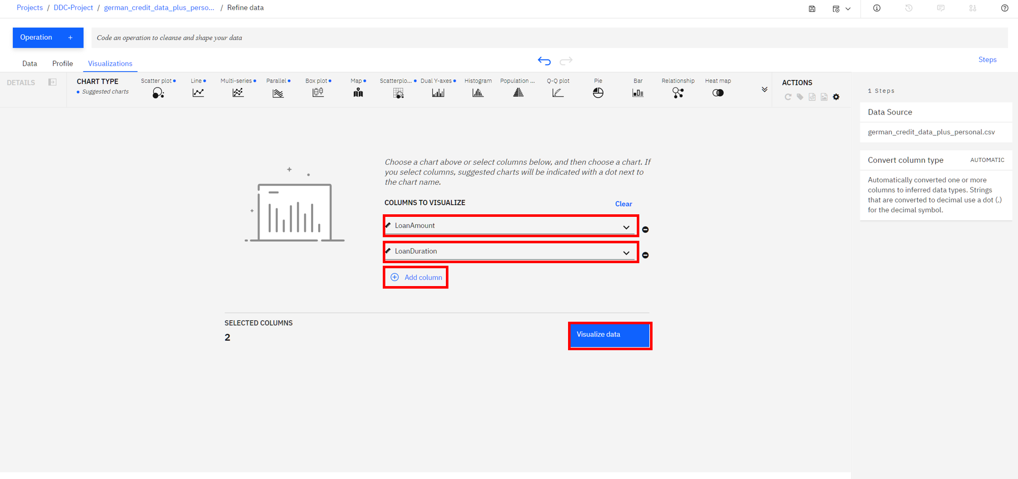
-
Remember that we are most interested in knowing how these features impact a loan being at the risk. So, let's add the
Riskas a color on top of our current scatter plot. That should help us visually see if there's something of interest here. -
From the left, click the
Color Mapsection and selectRisk. Also, to see the full data, drag the right side of the data selector at the bottom all the way to the right, in order to show all the data inside your plot.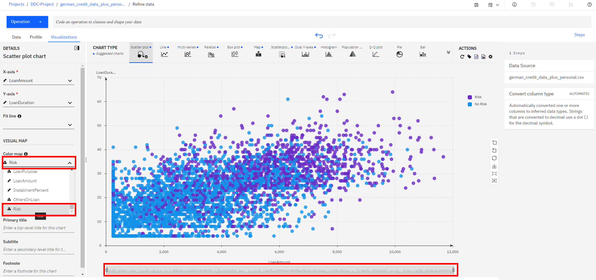
-
We notice that there are more risk (purple in this chart) on this plot towards the top right, than there is on the bottom left. This is a good start as it shows that there is probably a relationship between the riskiness of a loan and its duration and amount. It appears that the higher the amount and duration, the riskier the loan. Interesting, let's dig in further in how the loan duration could play into the riskiness of a loan.
-
Let's plot a histogram of the
LoanDurationto see if we can notice anything. First, selectHistogramfrom theChart Type. Next on the left, selectRiskin the Split By section, select theStackedradio button, and uncheck theShow kde curve, as well as theShow distribution curveoptions. You should see a chart that looks like the following image (move the bin width down to 1 if necessary).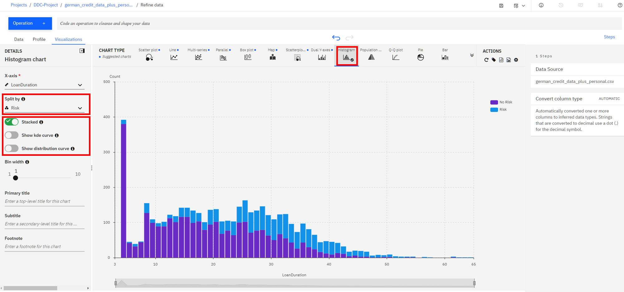
-
It looks like the longer the duration the larger the blue bar (risky loan count) become and the smaller the purple bars (non risky loan count) become. That indicate loans with longer duration are in general more likely to be risky. However, we need more information.
-
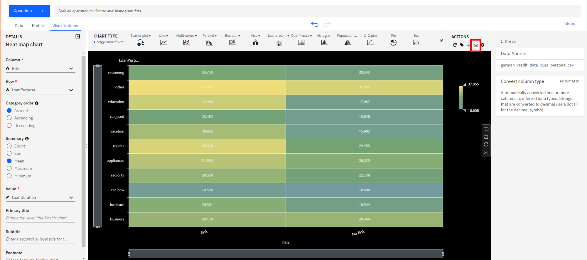
We next explore if there is some insight in terms of the riskiness of a loan based on its duration when broken down by the loan purpose. To do so, let's create a Heat Map plot.
-
At the top of the page, in the
Chart Typesection, open the arrows on the right, selectHeat Map(accept the warning if prompted).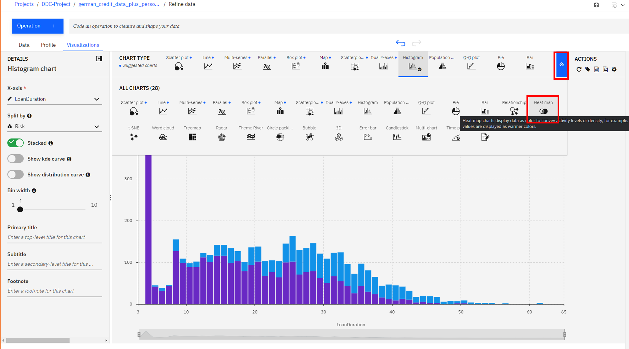
-
Next, select
Riskin the column section andLoanPurposefor the Row section. Additionally, to see the effects of the loan duration, selectMeanin the summary section, and selectLoanDurationin theValuesection.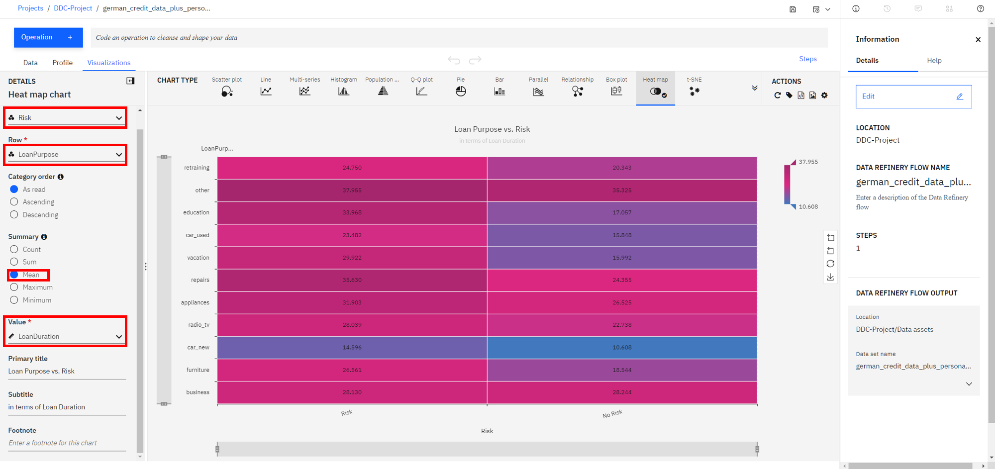
-
You can now see that the least risky loans are those taken out for purchasing a new car and they are on average 10 years long. To the left of that cell we see that loans taken out for the same purpose that average around 15 years for term length seem to be more risky. So one could conclude the longer the loan term is, the more likely it will be risky. In contrast, we can see that both risky and non-risky loans for the
othercategory seem to have the same average term length, so one could conclude that there's little, if any, relationship between loan length and its riskiness for the loans of typeother. -
In general, for each row, the bigger the color difference between the right and left column, the more likely that loan duration plays a role for the riskiness of the loan category.
-
Now let's look into customizing our plot. Under the
Actionspanel, notice that you can perform tasks such asStart over,Download chart details,Download chart image, or setGlobal visualization preferences(Note: Hover over the icons to see the names). -
Click on the
gearicon in theActionspanel. We see that we can do things in theGlobal visualization preferencesforTitles,Tools,Theme, andNotifications. Click on theThemetab and update the color scheme toDark. Then click theApplybutton, now the colors for all of our charts will reflect this. Play around with various Themes and find one that you like.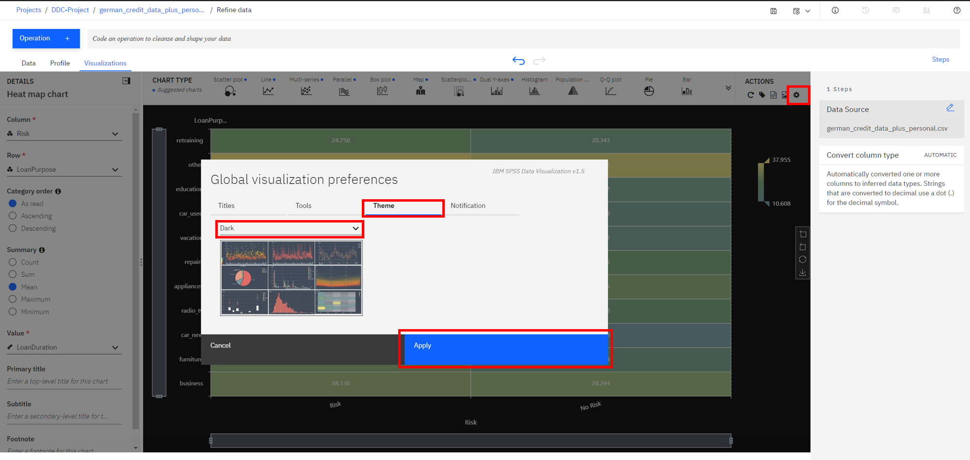
-
Finally, to save our plot as an image, click on the image icon on the top right, highlighted below, and then save the image.
Conclusion
We've seen a some of the capabilities of the Data Refinery. We saw how we can transform data using R code, as well as using various operations on the columns such as changing the data type, removing empty rows, or deleting the column altogether. We next saw that all the steps in our Data Flow are recorded, so we can remove steps, repeat them, or edit an individual step. We were able to quickly profile the data, to see histograms and statistics for each column. And finally we created more in-depth Visualizations, creating a scatter plot, histogram, and heatmap to explore the relationship between the riskiness of a loan and its duration, and purpose.