Data visualizations
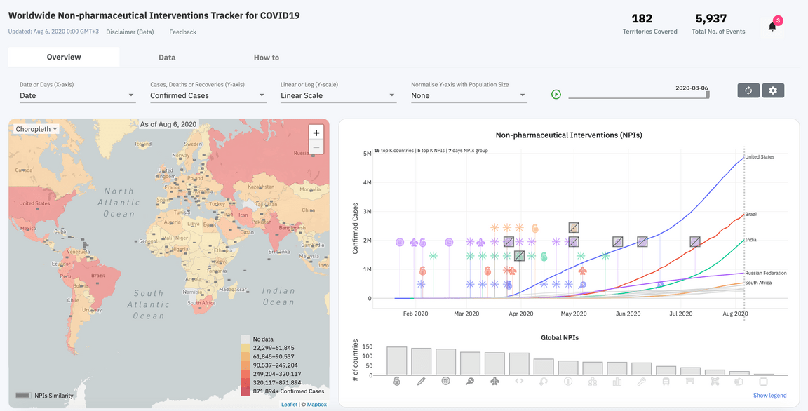
The NPI insights data browser illustrates associations between NPIs and COVID-19 outcomes including confirmed cases, deaths, and when available hospitalizations, testing, and recoveries, using an interactive chart, map, and histogram. The date of the data can be analysed with the Play slider on the control panel, where the NPIs and outcomes data can be visualized over time.
The chart visualizes the time points in which a geography imposes or lift an NPI along with the outcomes. The different types of NPIs are shown with a specific icon (select the legend) and groups of interventions are noted with the star icon. The number of countries/territories and the number of NPIs shown in the chart can be adjusted in the settings. The user can select a specific line on the chart referring to a territory to focus on what NPIs were imposed and lifted in that location. The histogram below the chart shows the number of territories that have imposed the different types of NPIs and can be selected to see the territories on the map that have imposed the selected subset of NPIs. On the map, a partially or completely gray-colored rectangle on each territory illustrates the proportion of the event types that have been imposed in that location. The map also shows the COVID-19 outcomes using choropleth, spikes or bubbles, and on each territory based on the COVID-19 outcomes selected. The user can interact with the territories on the map to focus on a location and view the data on the chart. Further, for some countries/territories admin 1 state/province level data are provided for further investigation, such as the US states, this will grow as finer-grained data is made available.
